Ruth Noble Interiors
Project: Creating a website for an Interior Design Consultant integrating eCommerce.
My Role: I had full responsibility for the entirety of this project which included:
- Project Management
- UX Design (User flows, wireframes)
- UI Design
- Site Development
- Client Communication
Project Summary
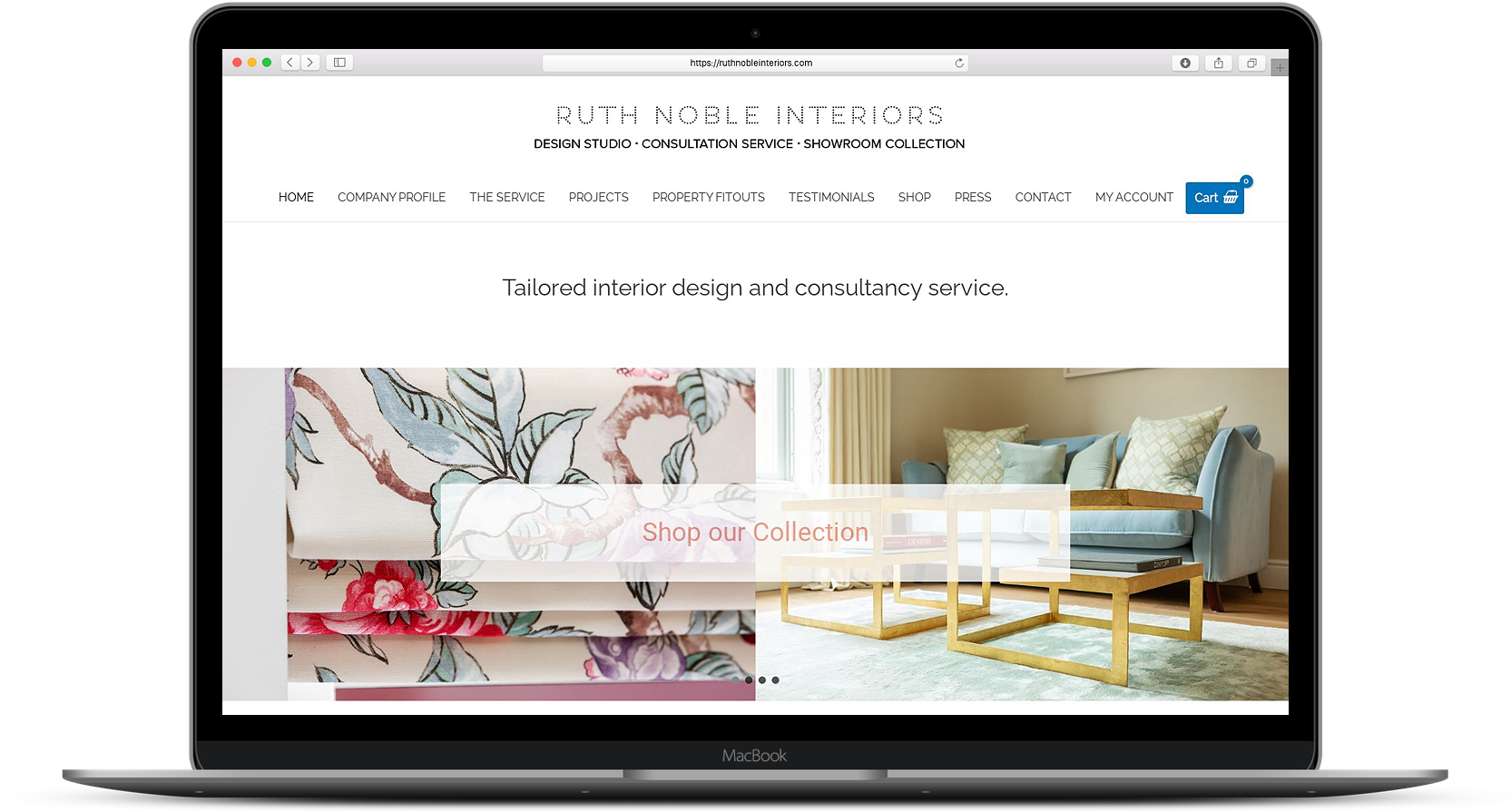
For this project, I was approached to design a new website for Interior Design Consultant, Ruth Noble Interiors. Ruth was already a client of mine and had a basic brochure website designed when starting her business but had now outgrown this. She wanted a new website that would highlight her services, showcase recent projects and allow customers to purchase furniture and related products from her online store.
The Challenge
To create a fully responsive mobile website that would have a great UX with clean modern UI that would bring together various elements of the Ruth Noble Interiors Brand. Namely her professional service, showcasing recent projects and fit-outs to show the end result of her work and have an online store where customers could purchase products from these fit-outs or similar items for their own interior design projects.
Goals
- Having a great overall UX with clear ways to find specific products
- Support a hierarchy that enabled a single page for individual products.
- Having an efficient checkout process.
Process
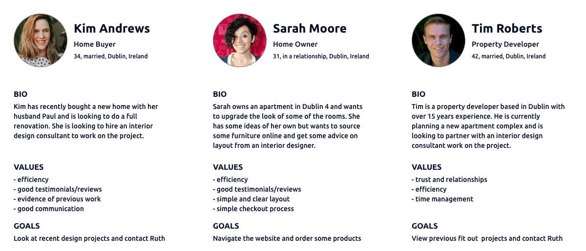
Ruths existing website was just a basic brochure website however we had previously set up Google Analytics on there which I could use to get some idea of who a typical user was to her website. In particular, it gave me certain demographic information, typical locations her users were from and an indication of what pages on the current website were post popular. Having reviewed this information I ask spoke to Ruth about her typical clients and the enquiries they reached out to her about. This gave me a clear definition of three types of persona that typically come to the Ruth Noble website and their needs, values and pain points.
Based on these three user personas, I identified the main user needs I wanted to address in the new website while also taking into consideration the needs of Ruth Noble Interiors.
These primary needs I defined as:
- Customer brand relationship through existing projects and testimonials to establish trust.
- A clean and modern UI easily navigable on all devices.
- A clean and seamless shopping experience.
- Product search and filtering to easily find products.
- Efficient checkout process to save users time and allow for easy purchase of products.
At this stage, I begin some competitor analysis in particular focusing on the e-commerce part of the website and what functionality was standard across most competitors. For the most part, there were common trends across all of the websites I looked at so I compiled a list of those that were consistent and in line with the needs of the user personas.
The functionality I defined as:
- Search Bar
- Sign In and User Accounts
- Sort By (price, popularity etc)
- Product Filtering
- Guest Checkout
- Product Dimensions
Sitemap
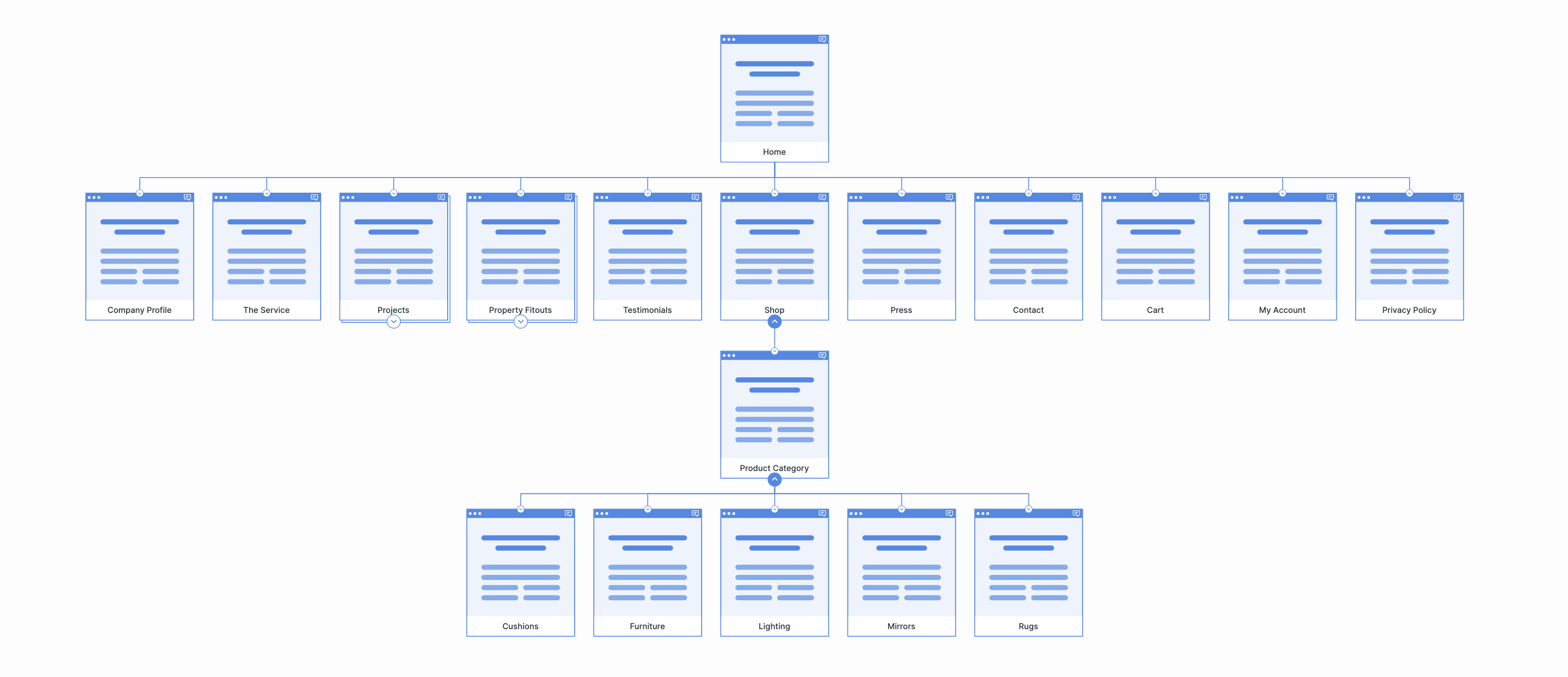
With the results of the competitor analysis and inspiration from other competitor websites, I next created a site map to define the overall structure of the website. This allowed me to define the other pages required on the website and also define the breakdown of product categories to define a clear location for individual products on the website and for Ruths own organisation of her inventory. It also ensured that we placed products where users would expect to find them and that the shopping experience when visiting the website would be intuitive and easy to use.
User Flow
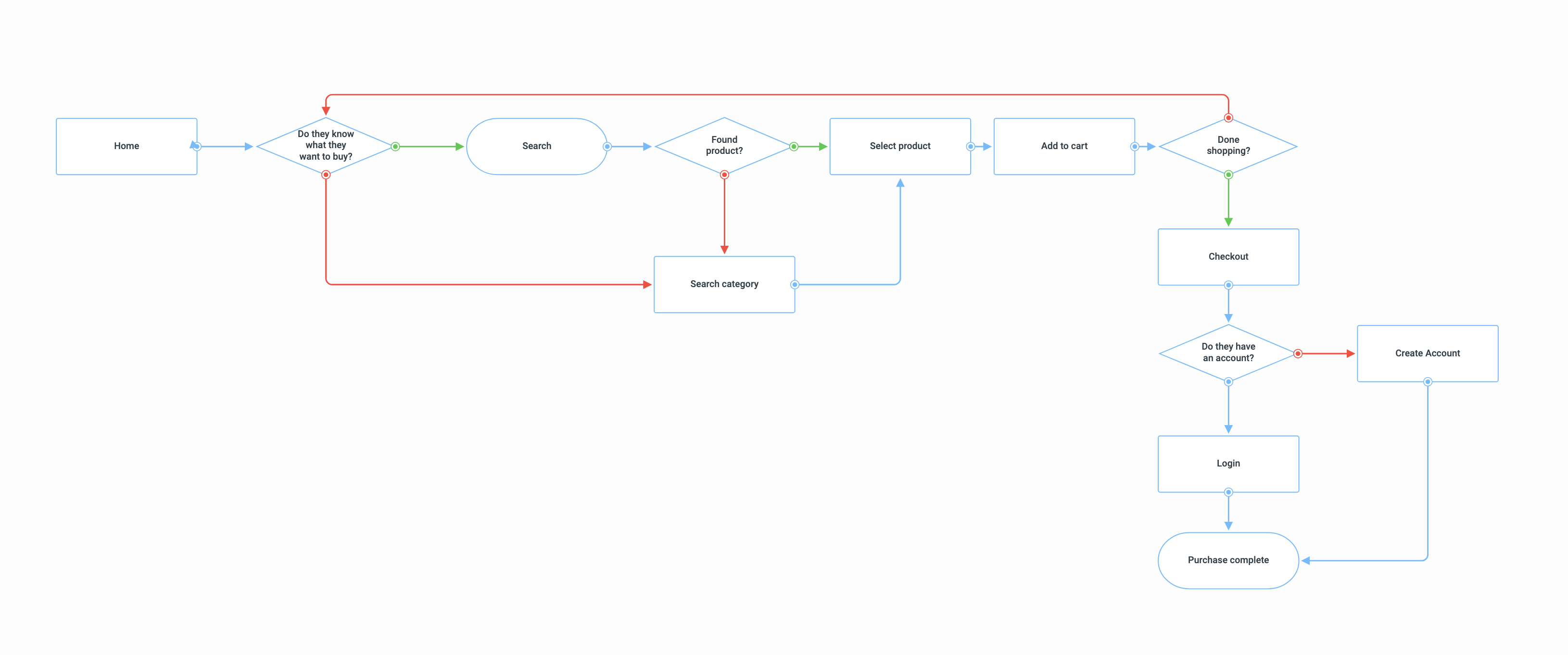
For the shopping experience, I decided to design a user flow as an efficient and easy to use process was something that was important in the personas. This enabled me to define the steps a user might take when looking to purchase a product on the website depending on if they already knew what they were looking for or wanted to browse. Once they had found the item they wanted then how they would proceed from there to the checkout and complete the order.
In the user flow if the customer knows what they are looking for they can simply search by name and from there select the product and it to the cart. If they don't they can use the category to narrow down their search and browse the available products until they find what they are looking for and then add it to the cart. From there the checkout process can be completed as a guest checkout but those who wish can also login or create an account before finishing the purchase. Adding an account allows the user additional functionality such as reviewing past orders and saving their shipping and billing information.
Wireframes
Having created the user flow I next moved on to creating a set of wireframes for the layout and structure of the website using my sitemap as the basis for the pages and navigation. Below are some of the wireframes, in particular focusing on the e-commerce part of the website and the core product and single product pages.
1. Homepage
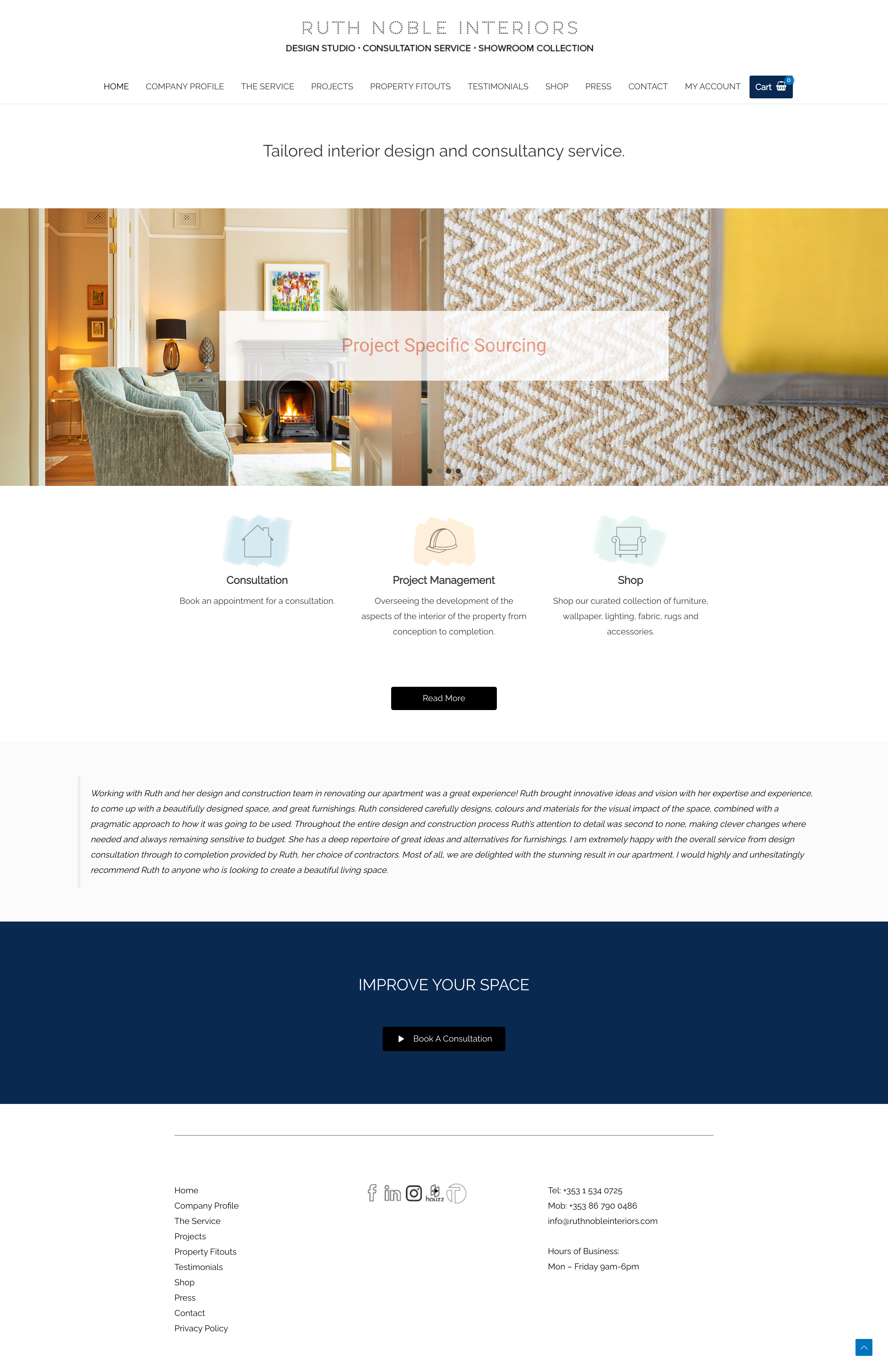
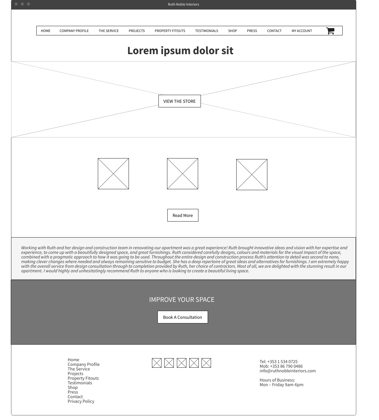
For the homepage, I wanted to keep it as clean as possible and not overcrowd it. While e-commerce was a part of the site it was important also to not make it the sole focal point of the website which needed to also showcase the services and projects completed by Ruth and the shop as an accompanying service tieing in with the whole brand. Across the top of the page, a hero image with a button as a call to action can bring the user directly to the store if they wish. Underneath that is some information about the services with a read more button which brings the user to the services page which goes into greater detail. Below that a carousel of testimonials that highlight the trust and loyalty in the brand from previous customers and finally a strong call to action to book a consultation with Ruth.
2. Product page
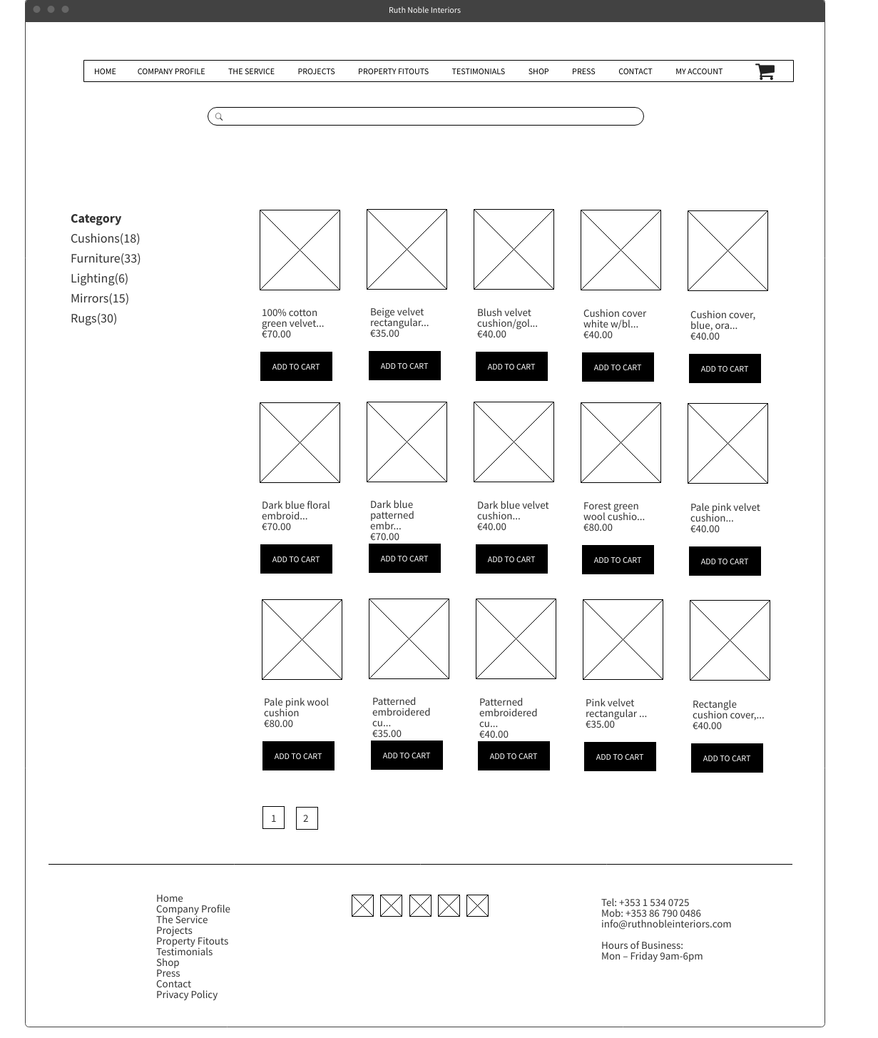
Visting the store from the call to action or the main navigation brings the user to the main categories page. This displays images of the 5 categories of product available with titles, clicking on any of these will then bring the user to the products page for that category which displays a grid layout of all products available. From here the user can click add to cart or can click on the product image or title to view the single product page and see more information. A search bar is also available on the category and product page where the user can search directly for a product by keyword.
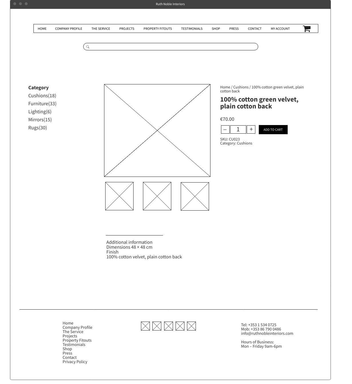
3. Single Product page
The single product page contains a detailed product description to make sure the product is a match for the customer's needs including product images which can be zoomed in on for more detail.
Breadcrumb links make navigating back to the previous page easy. Should the user wish to buy multiple of a product they can easily add more. Add to cart will then add the items to their cart. At any point, the user can also hover on the cart icon in the main menu to see a drop-down summary of all items currently stored in the cart.
4. Checkout Process
A main pain point for the personas and e-commerce customers in general is the checkout process so this was made as seamless as possible offering options of both guest checkout and as an account-based customer. A returning customer has the option to simply log in to their account and have their saved shipping and payment information auto-filled in for them. They can also track orders and view previous orders through their account area. Those wishing to just use guest checkout can do so by filling out their billing and shipping details along with their card information and completing the purchase. Either option does not require the user to navigate to a different page and will simply update the checkout page depending on whether they are logged in or not.
User Testing
Using the completed set of wireframes I next went about performing some user testing to verify the structure of the website was clear and navigation for the user flow and e-commerce experience was simple and intuitive.
Testing was done with 5 users given 2 tasks to complete.
Task 1: Purchase 2 Forest green wool cushions
Task 2: Navigate to the Dublin Penthouse Fitout and view the gallery and then book a consultation.
Overall the testing went well, users were easily able to navigate through the site and perform the tasks given. Some confusion existed with the book a consultation as to whether that was to be done through the contact page or via the call to action button on the homepage - so the call to action was carried across to other relevant pages to make the process more seamless and give the user that option throughout.
Final UI Designs
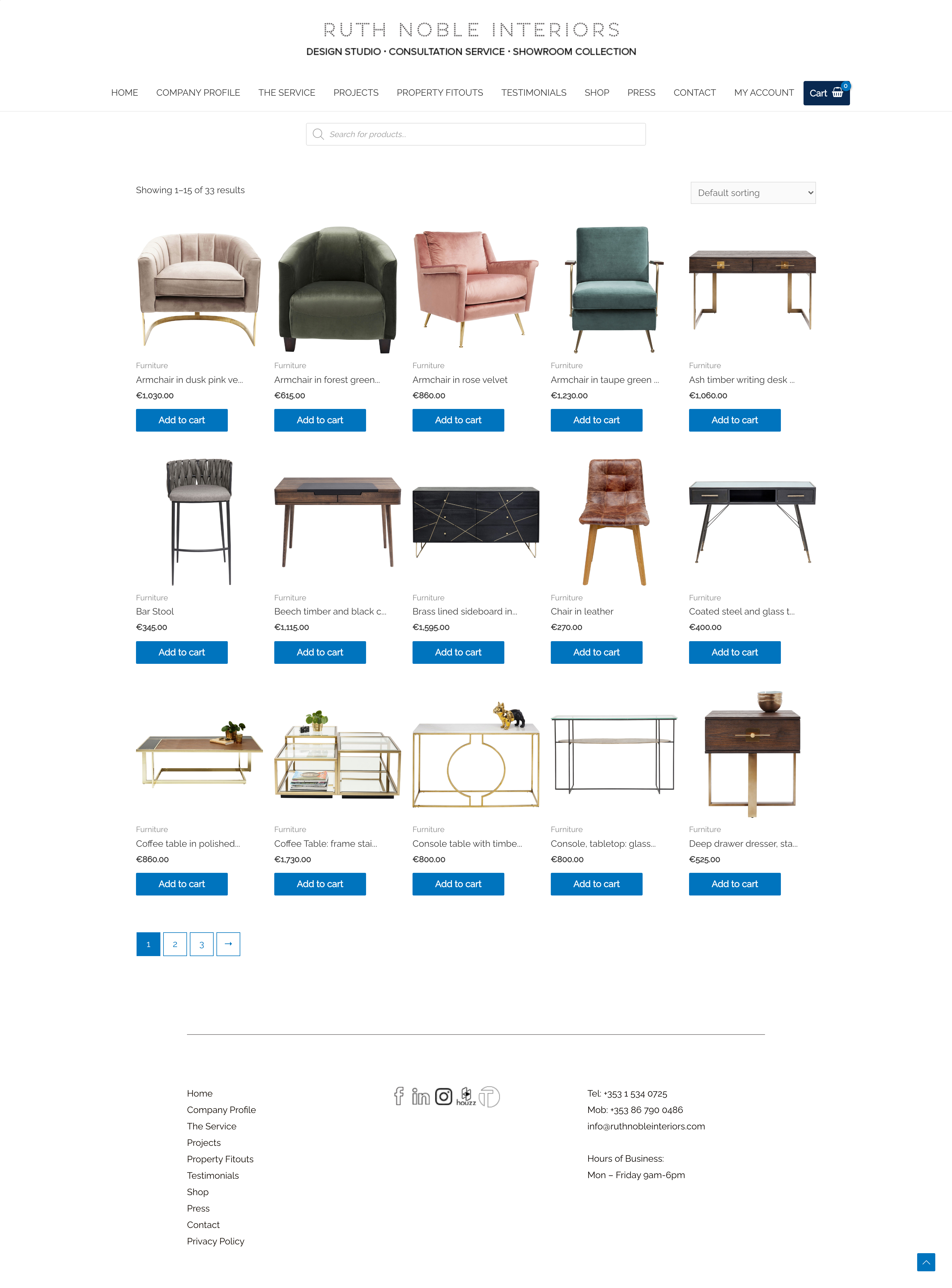
The final part of the project was to create the finished UI and develop the website. The brand's identity and colours were incorporated into the design and used throughout.
Results and Outcomes
The new website has been a great success and generated a lot more business for Ruth across all aspects of the brand. Further improvements over time have been discussed once more data is available in terms of what products sell and what ones don't and how highlighting best sellers and recommended purchases to accompany selected products can help drive sales of those items. Google analytics and the e-commerce statistics will be able to provide insight into what products users are interested in but maybe not purchasing and there is the possibility of looking into adding some cart abandonment functionality to follow up with the customer to try to encourage them to continue with those purcahses.

